Your guide to a successful university website

What everyone notices about universities is the one thing universities don’t see about themselves: their websites are a disaster. The layouts are confusing, information is buried, links are (often) broken, and news is outdated.
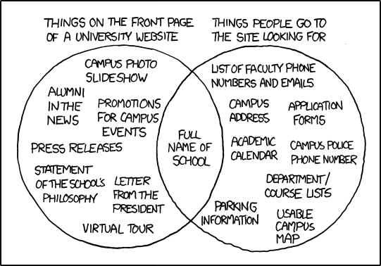
This recent comic from the smart folks at xkcd clearly demonstrates the point:
When students and applicants visit a university’s website, the front page should not read like a distracting infomercial or advertisement, nor should it overwhelm visitors with ‘circular links’ that send them astray, down a garden path, only to end up back at square one.
In an age of instant gratification and immediate access to information, internet users of the 21st century expect the same reliable experience from a university website. They are reasonable to expect easy-to-find, navigable information – a feat that is surprisingly difficult for universities to achieve.
The value of a decent website
As any entrepreneur or marketer will tell you, having a decent website is akin to making your first impression in a job interview. If information appears to be scattered, and the visual design is sloppy and lazy, users are unlikely to return to that site, or continue using it (much less decide to register or apply).
Students who visit university websites for the first time are not looking to hire someone or purchase something, per se, so much as they are trying to find direct and clear information about studying, applying, and enrolling (which does, eventually, result in them paying for their education). If a prospective student is able to find everything she needs in a manner that is quick and clear – with a logical navigation and link structure – she is likely to return, either to reference the information again or to start filling out the university application. Otherwise, the initial reaction to a site that is messy or lacks usability will be: ‘I can’t be bothered to navigate this labyrinth.’
Tips for making your website more inviting
Piecing together an inviting website doesn’t need to be a puzzle. Here we will provide a few ingredients for a successful, more inviting, and attractive university website:
- Simplicity. A good website restricts its layout to just a few colours (or, even, one colour on the navigation bar), and limits the use of flashy slideshows, images, or infographics.
- Concise and detailed. You should give clear and detailed information directly, rather than bury it in .pdf files or brochures. The faculty directory, for example, shouldn’t require too many steps to get to. This tip also extends to the pages for different programmes. Outline the basics of the curriculum, give clear requirements (for the programme itself as well as the application), and provide an easy directory to faculty pages.
- Keep contact or outreach links to a minimum. If you want visitors to reach out to faculty, register with the website, download information, or fill out an application, ‘lead’ links can be a useful way to convert the visitors into students (or members). However, don’t overwhelm users with all of the lead links on every page. Rather, every lead link you provide should only occur about once per programme page. Furthermore, these links should deliver on their explicit promise. If the link says ‘Contact an Advisor’, a user expects to find either a.) a directory; or b.) a form to fill out a direct message to the department advisor. Similarly, a link that says ‘Apply Now’, should actually lead to the application form – not a site telling me ‘why I should apply for this programme’.
- Refrain from providing external links. Having too many external links to social media and videos can unnecessarily distract the users or lead them to other sites, lowering the chance of having them register or take action.
- Embed media and images. If you want to show students videos or provide additional (and more entertaining) features, you should embed them on your site, rather than directing the visitors to youtube. However, you should only stick with media that enhances the programme and supports the overall message, instead of unnecessary and overly generic stock videos.
For each individual department or programme, make information directly and readily available. As a prospective student I immediately want to see:
- Application deadlines and requirements
- Admission process
- Funding opportunities and scholarships
- Career Prospects
- Detailed faculty profiles
- Explanation about the programme/degree itself (e.g. ‘why should I study in this programme at this university?’)
Getting users to take action
When it comes to actually applying, registering, or enrolling, students can be discouraged by long forms that ask too many questions. In fact, with forms that appear too long and involved in the beginning, we’ve noticed that prospective students have 20% less chance of actually following through on the lead.
When you’re trying to get someone to follow through on an application or registration form, ask questions that can assess the candidate’s qualifications and profile, so that your form is actually delivered to a viable prospect (i.e. someone who meets your search criteria). Asking students what their budgets are, for example, can determine whether they have the means to pay the tuition, or whether you ought to encourage them to apply for scholarships. Additionally, asking questions like ‘do you already have (or plan on obtaining) a Bachelor’s degree in this subject’ can ensure that the prospective students have the correct qualifications for your programme (and that you are not wasting each other’s time).
At the first point of contact with the student (i.e. on the first page of the registration or application form), asking for extensive information is unnecessary and can deter users from continuing. So you should refrain from asking personal information about their background on the first page.
Google Analytics and tracking leads
Google Analytics can be a great tool for evaluating the search behaviour of users to your university website. If Studyportals, for example, sent a student to your site directly from our programme pages, Google Analytics can capture this information into an invisible lead form. Additionally, you can determine basic information about users, including which location they are searching from, what devices they are using, and how long they remained on your page.
This can be especially helpful once you start implementing the tips above. See whether your website actually improves the user’s experience and generates more value to your university’s site. You can contact one of our many specialists to hear more information about Google Analytics and how to improve the success of your university website.
For more updates, follow us!